Kitchen Rehab: How to Choose the Perfect Color Palette for Your Space

Are you tired of the outdated and dull color scheme in your kitchen? It's time for a kitchen rehab! Choosing the perfect color palette for your space can transform the entire look and feel of your kitchen, giving it a fresh and vibrant atmosphere. But with so many color options available, how do you know which ones to choose? In this article, we'll guide you through the process of selecting the ideal color palette for your kitchen.
Whether you prefer a bold and dramatic look or a soft and soothing ambiance, the right color scheme can make all the difference. We'll help you consider factors such as the size and layout of your kitchen, the amount of natural light it receives, and your personal style preferences. From classic whites and neutrals to trendy blues and greens, we'll explore the various color options and their effects on your kitchen's aesthetic.
With the right color palette, you can transform your kitchen into a space that reflects your personality and creates an inviting atmosphere for cooking, dining, and entertaining. Say goodbye to the boring and hello to the beautiful – let's dive into the world of kitchen color palettes!
Importance of choosing the right color palette for your kitchen
The kitchen is the heart of the home, where families gather to cook, eat, and make memories. It's important to create a space that not only functions well but also reflects your personal style and aesthetic. The color palette you choose for your kitchen sets the tone for the entire space, influencing the mood and atmosphere. Whether you want a warm and cozy kitchen or a sleek and modern one, selecting the right colors is crucial.
A well-chosen color palette can also make a small kitchen feel larger or add depth to a large kitchen. It can create visual interest and highlight architectural features or focal points. The colors you choose can also affect your appetite and energy levels. For example, warm colors like red and orange are known to stimulate appetite, while cool colors like blue and green have a calming effect.
Understanding color theory and its application in kitchen design
Before diving into the world of kitchen color palettes, it's important to understand the basics of color theory. Color theory is the study of how colors interact with each other and how they can be used to create different effects. It involves understanding concepts such as hue, saturation, and value.
Hue refers to the pure state of a color, such as red, blue, or yellow.
Saturation refers to the intensity or purity of a color, with highly saturated colors being vibrant and bold, and desaturated colors being more muted.
Value refers to the lightness or darkness of a color.
In kitchen design, color theory can be used to create harmony and balance. Complementary colors, which are opposite each other on the color wheel, can create a vibrant and dynamic look. Analogous colors, which are next to each other on the color wheel, can create a harmonious and cohesive look. Understanding color theory will help you make informed decisions when choosing your kitchen color palette.
Factors to consider when choosing a color palette for your kitchen
1. Think about the size and layout of your kitchen
Lighter colors can make a small kitchen feel more spacious, while darker colors can add warmth and coziness to a large kitchen. Consider the amount of natural light your kitchen receives, as this can affect how colors appear. If your kitchen lacks natural light, you may want to choose lighter colors to brighten the space.
2. Think about your personal style preferences
Are you drawn to bold and dramatic colors, or do you prefer soft and soothing tones? Think about the overall aesthetic you want to achieve in your kitchen. Do you want a traditional, modern, or eclectic look? Your color palette should align with your style preferences and complement the other elements in your kitchen, such as the cabinets, countertops, and flooring.
3. Consider the functionality of your kitchen
If you do a lot of cooking and entertaining, you may want to choose colors that are easy to clean and maintain. Consider the durability of the paint or finish you choose, especially in high-traffic areas like the backsplash or kitchen island.
Popular color palettes for kitchens and their effects
There are endless color possibilities for your kitchen, but some color palettes are more popular than others. Let's explore a few popular color palettes and their effects on your kitchen's aesthetic.
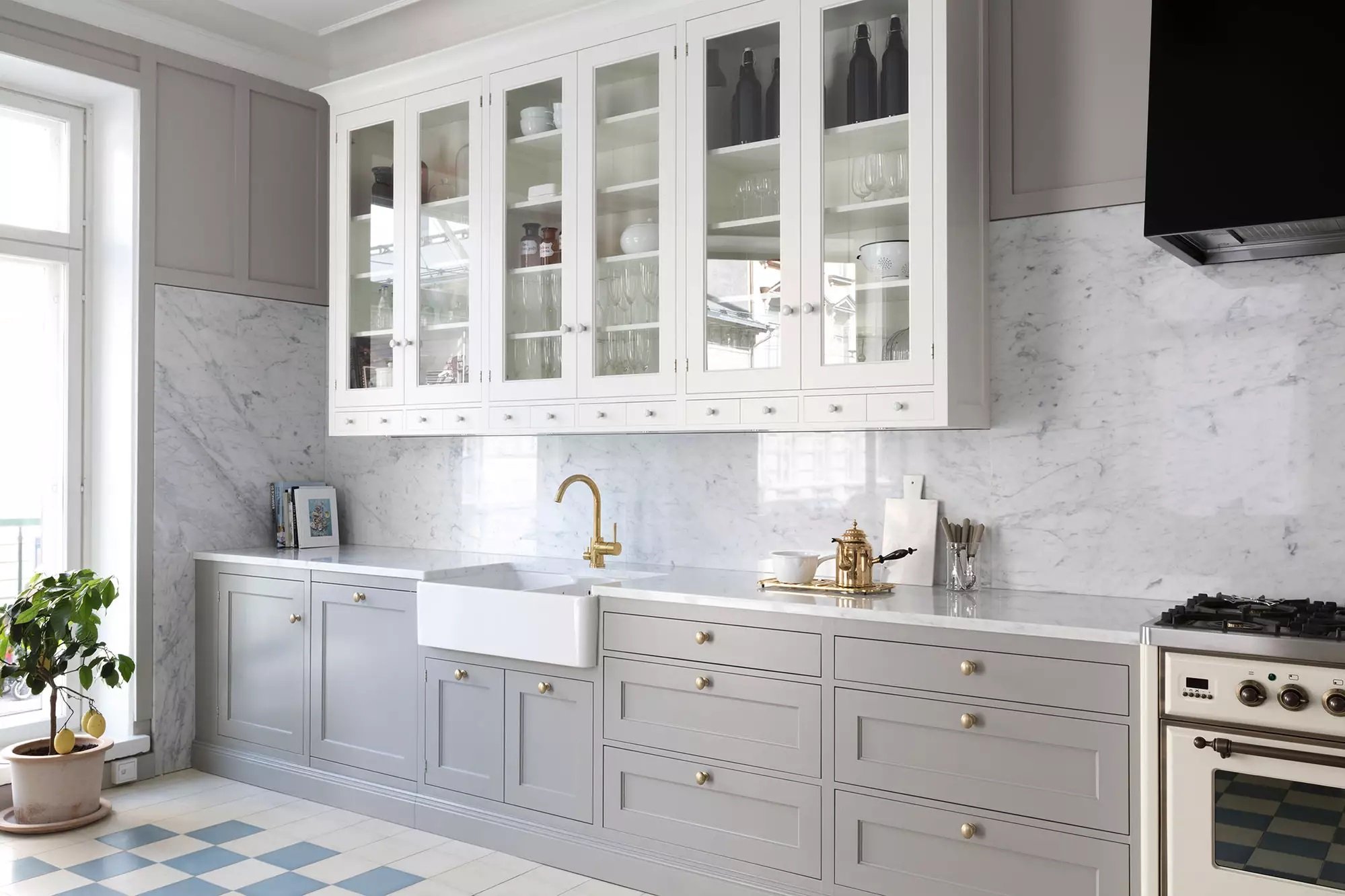
1. Classic Whites and Neutrals

Modern & Traditional Style Kitchens
White kitchens are timeless and versatile. They create a clean and fresh look, making the space feel open and airy. Neutrals like beige, gray, and taupe can also create a warm and inviting atmosphere. These color palettes work well in both traditional and modern kitchens.
2. Bold and Dramatic

Any Style Kitchen
If you want to make a statement, consider using bold and dramatic colors in your kitchen. Reds, blues, and greens can add vibrancy and personality to the space. However, it's important to use these colors sparingly and balance them with neutral tones to avoid overwhelming the space.
3. Soft and Serene

Coastal & Cottage Style Kitchens
If you prefer a calm and soothing ambiance, consider using soft and serene colors in your kitchen. Pastels like light blues, greens, and yellows can create a peaceful and relaxing atmosphere. These colors work well in coastal or cottage-style kitchens.
4. Earthy and Natural

Rustic & Farmhouse Style Kitchens
For a warm and inviting kitchen, consider using earthy and natural colors. Shades of brown, tan, and green can create a cozy and organic feel. These colors work well in rustic or farmhouse-style kitchens.
How to create a cohesive color scheme for your kitchen
Creating a cohesive color scheme for your kitchen involves selecting colors that work well together and create a harmonious look. Here are some tips to help you create a cohesive color scheme:
1. Start with a focal point
Choose a focal point in your kitchen, such as the cabinets or a bold backsplash, and use it as a starting point for your color palette. Pull colors from the focal point and use them throughout the space.
2. Use the 60-30-10 rule
Divide your color palette into three main colors – a dominant color that covers 60% of the space, a secondary color that covers 30%, and an accent color that covers 10%. This rule helps create balance and visual interest.
3. Consider the color temperature
Colors can be warm or cool, and it's important to consider the color temperature when creating a cohesive color scheme. Warm colors like red, orange, and yellow create a cozy and inviting atmosphere, while cool colors like blue and green create a calm and refreshing feel.
4. Use shades and tones
Instead of using a single color, consider using different shades and tones of the same color. This adds depth and dimension to your color palette.
5. Test your color palette
Before committing to a color palette, test it in your kitchen. Paint swatches on the walls and observe how they look under different lighting conditions. Consider how the colors interact with the other elements in your kitchen, such as the cabinets and countertops.
Tips for incorporating color into different kitchen elements
Once you've chosen your color palette, it's time to incorporate it into different elements in your kitchen. Here are some tips for incorporating color:
1. Paint the walls
The easiest way to add color to your kitchen is by painting the walls. Consider using your dominant color for the walls and balance it with secondary and accent colors in the accessories and decor.
2. Cabinets and countertops
If you want to make a bold statement, consider using your secondary color for the cabinets or countertops. If you prefer a more subtle look, use your dominant color for these elements.
3. Backsplash and flooring
Your backsplash and flooring are great opportunities to add accent colors to your kitchen. Consider using bold patterns or colorful tiles to create visual interest.
4. Accessories and decor
Use accessories and decor to add pops of color to your kitchen. This can include items like rugs, curtains, dishware, and artwork. These elements can be easily changed or updated to refresh the look of your kitchen.
5. Lighting
Don't forget about lighting when incorporating color into your kitchen. Consider using colored pendant lights or under-cabinet lighting to add a subtle touch of color.
Examples of stunning kitchen color palettes for inspiration
To inspire you in your color palette selection, here are a few examples of stunning kitchen color palettes:
1. Coastal Chic

Dominant color – light blue, Secondary color – white, Accent color – coral.
2. Modern Monochrome

Dominant color – black, Secondary color – white, Accent color – metallic silver.
3. Rustic Retreat

Dominant color – warm brown, Secondary color – sage green, Accent color – cream.
4. Radiant Energy
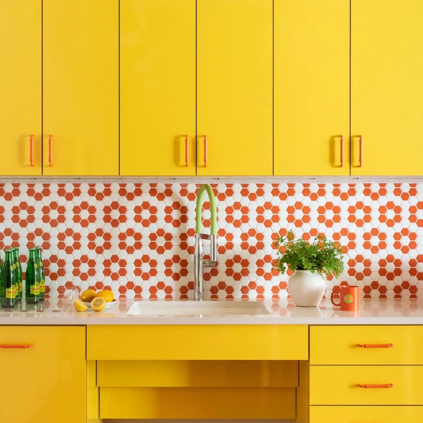
Dominant color – Decisive Yellow, Secondary color – White, Accent color – Brick Red.
These examples show how different color palettes can create unique and beautiful kitchen designs. Let your imagination run wild and create a color palette that speaks to your style and personality. For additional inspiration on kitchen color ideas, Architectural Digest is a great resource!
Tools and resources for selecting the perfect colors for your kitchen
Choosing the perfect colors for your kitchen can be overwhelming, but luckily there are tools and resources available to help you. Here are a few:
1. Color swatches
Many paint companies offer color swatches or sample pots that allow you to test colors in your kitchen before committing to a full paint job. Take advantage of these tools to see how the colors look in your space.
A great resource would be your local Sherwin Williams as they offer a large variety of color options.
2. Online color visualizers
Several websites and apps offer color visualizers that allow you to see how different colors will look in your kitchen. Upload a photo of your kitchen and experiment with different color options.
A great resource for this would be the HGTV HOME color visualizer!
3. Design magazines and websites
Flip through design magazines or browse websites for inspiration. Look for kitchens with color palettes that resonate with you and save them for reference.
A great resource for this would be Better Homes & Gardens. They provide great color inspiration!
4. Consultation with a professional
If you're feeling overwhelmed or unsure about choosing the right colors, consider hiring a professional color consultant or kitchen designer. They can provide expert advice and help you create a color palette that suits your style and needs.
Conclusion: Transforming your kitchen with the perfect color palette
Choosing the perfect color palette for your kitchen can be an exciting and transformative process. By considering factors like the size, layout, and lighting of your kitchen, you can narrow down your options and find the colors that best suit your space. Whether you opt for classic whites and neutrals or embrace bold and vibrant hues, the right color scheme can breathe new life into your kitchen and create a space that reflects your personality and style.
So, don't be afraid to experiment with different colors and combinations. With a little creativity and imagination, you can turn your kitchen into a beautiful and inviting space that you'll love spending time in. Say goodbye to the boring and hello to the beautiful – start your kitchen rehab today!